The Software as a Service (SaaS) business model is one of the booming sectors within cloud computing. The SaaS service providers provide customers access to software applications over the Internet, eliminating the need to install, manage, or maintain any software or hardware.
Small and medium-sized businesses favor SaaS applications due to the cost-effectiveness, convenience, and flexible solutions available in the market. Today, SaaS applications are diverse, ranging from email and CRM to complex business applications. Major players include Microsoft, HubSpot, Stripe, Atlassia, and Google, offering a wide array of services to millions of users globally.
The SaaS business uses various business models to generate revenue. The subscription model is one of the most common, where customers pay a recurring fee to access the application, often on a monthly or annual basis. Another popular model is a freemium model, offering basic service for free while charging for premium features. Additionally, there is a usage-based model where pricing is determined based on consumption, aligning costs more closely with usage patterns. This model is frequently used by cloud computing companies such as Amazon, Microsoft, and Google.
A SaaS Prospective Customer Journey
A SaaS customer’s journey starts at the awareness stage. First, prospective customers discover SaaS products through avenues like referrals, search engines, or social media. If a potential fit is identified, the prospect delves deeper, exploring the features and benefits, assessing the product’s suitability, and comparing it with other options available. After this assessment, if the prospect deems the product a good fit, they move to subscribe to the service. Depending on various factors, the prospect might take days, weeks, months, or even years to make the purchasing decision.
A well-crafted SaaS business website plays a pivotal role in this journey. It should offer relevant information at each stage—awareness, consideration, and conversion—effectively converting prospects into customers. The focus of this article is to delve into the top 10 essential features or pages pivotal for a SaaS business, so you can launch or optimize your website for a frictionless customer journey.
Awareness Stage
Consideration Stage
Conversion Stage
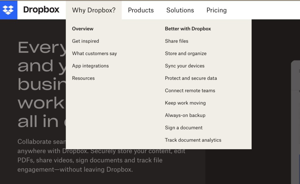
Why page
A “Why” page is a vital element of a SaaS business website, serving as a space to articulate the unique value proposition and distinct advantages of the product. It is critical as it addresses the fundamental question, “Why should a prospective customer choose your product?” By convincingly articulating the answer, you can influence the customer’s decision-making process and differentiate your brand from competitors.
Key elements of the “Why” page should include:
- A clear value proposition that succinctly describes your product’s features and benefits
- Highlighted Unique Selling Points (USPs) that showcase your product’s advantages and distinguish your features from the rest of the competition.
- High-quality product images and videos illustrating your product’s features and emphasizing user experience.
- Displays of awards, certifications, brands worked with, or customer testimonials providing validation and reliability of your product.
- Calls-to-Action that guide users to the next steps, whether it’s learning more about the product, requesting a demo, or signing up for the product.
“How It Works?”
Once the prospective customer understands your value proposition, the next question that pops into their mind is, “How does it work?” Therefore, the “How It Works?” section or page is essential in the customer journey. It is designated to illustrate the functionality and usage of the product or service. This page should reduce the perceived complexity of the service, alleviate uncertainties, instill confidence, and put the prospect at ease.
The key elements of a compelling “How It Works?” page include:
- Step-by-Step Instructions: Break down the process of using the service into manageable, understandable parts.
- Visual Aids: Use images, diagrams, and videos to illustrate concepts and actions effectively, making the content more digestible.
- Interactive Elements: Demos or walkthroughs allow users to experience the service interactively, enhancing their understanding and engagement.
- FAQs: Addressing operational queries are important in resolving doubts and providing additional clarifications.
- Clear and Concise Text: Crucial in explaining the workings of the service without overwhelming the users.
- Navigation Options: Allow users to easily move between different sections or steps, enabling them to explore and revisit information effortlessly.
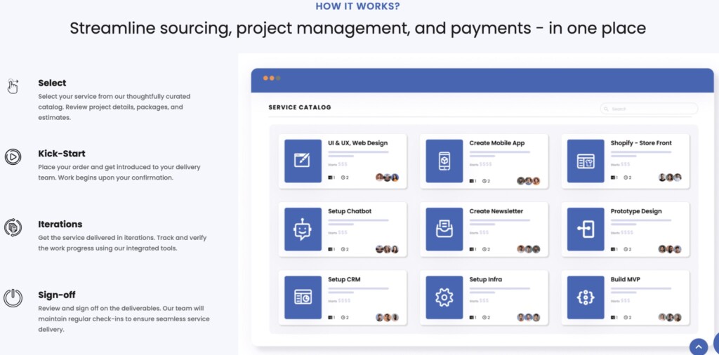
In essence, creating a comprehensive, user-friendly “How It Works?” page is about combining clarity, simplicity, and interactivity. This provides a thorough understanding of your product workflows, thus facilitating a smoother, more informed user journey.
Solutions
So far, the “Why” and “How It Works” sections have addressed generic, high-level customer needs or problems. As a next step, prospective customers are considering how to use your solution to solve their specific needs or problems. The “Solutions” page is constructed for this purpose, illustrating how the service can be employed to address specific challenges or optimize processes. This page is crucial in a customer’s journey, acting as a persuasive agent, showcasing the software’s capabilities and its practical applications for the specific ideal client profile or customer segment. It’s the juncture where prospective clients discern the value and relevance of the service to their unique contexts and explore how it aligns with their goals or requirements. Below are some of the ways you can group your solutions:
Grouping by Use Cases
Grouping by use cases allows users to see how the software can be applied to specific scenarios or problems they might be facing. It relates the software’s functionality directly to real-world applications, enabling users to gauge its efficacy and relevance.
Grouping by Industries
Grouping by industries enables users from different sectors to perceive how the software can be integrated into their specific situations. This categorization aids users in various fields like healthcare, education, or finance in swiftly identifying industry-specific benefits and applications.
Grouping by Roles
Grouping by roles helps in portraying how the service can be beneficial to individuals with different responsibilities within an organization, such as managers, technicians, or administrators. It caters to the varying needs of different job functions, ensuring that each potential user perceives the value of the service from their professional standpoint.
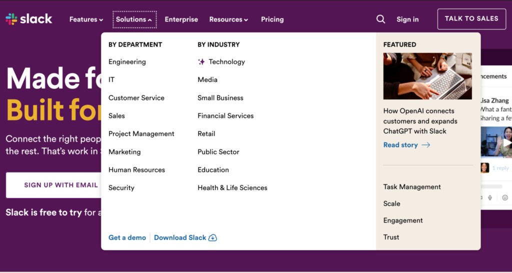
In summary, the objective of the “Solutions” page is to transform abstract product features into tangible benefits. It allows prospects to visualize the practicality and effectiveness of your solutions in their operational context. This clarity accelerates the decision-making processes and bolsters the likelihood of conversion.
Resources
During the customer’s journey, some prospects convert faster than others, depending on the severity of their challenges. The “Resources” page or module is dedicated to providing valuable content and tools to support, educate, and engage both prospective and existing customers.
This page serves a dual purpose: it first acts as a knowledge hub, helping users maximize the value they receive from the service and addressing their queries and challenges. Secondly, it enhances SEO rankings and establishes the brand as an authority in its domain. Below are some of the key elements of the “Resources” page:
- Blog Posts: Provide insights, updates, and valuable information related to the product or industry
- FAQs: Vital to address common questions and clarify doubts promptly.
- White Papers and eBook’s Offer in-depth knowledge on specific topics, while Webinars and Tutorial Videos facilitate learning through visual and interactive content.
- Case Studies: Showcase real-world applications and successes of the product.
- Templates or Tools: Can offer practical aid in utilizing the product effectively.
- Forums or Community Discussions: Provide a platform for users to interact, share experiences, and seek advice.
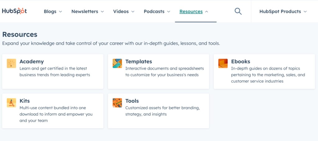
In conclusion, a meticulously curated “Resources” section is a cornerstone for user engagement, education, and brand authority in a SaaS business. It should encompass diverse content formats and address varying user needs and preferences, offering a holistic learning and support environment.
Pricing
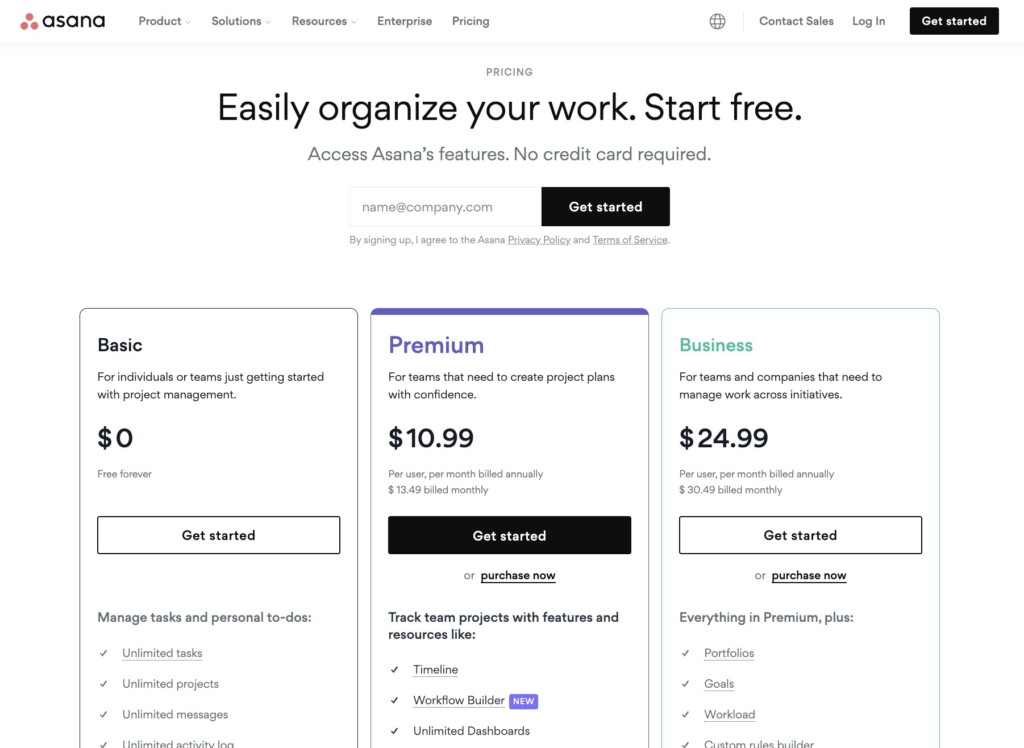
Pricing is one of the key decision making information for any product or services. Hence, the pricing page is a critical component of a SaaS business website as it directly addresses how much the service costs, impacting the user’s decision to purchase.
This page is important as it helps prospective customers understand the cost against benefits offered. An effective pricing page is transparent, straightforward, and user-centric, facilitating a prospective customer’s journey from consideration to conversion. The pricing page often determines whether a visitor converts into a paying customer, making it a key component in the product and your business success.
Depending upon your business model, a good SaaS pricing page should have a clear and concise layout, displaying the different plans available, the cost of each, and the features included. It should clearly differentiate between plans (or tiers) and highlight the unique selling propositions of each. Here are a few key elements of your pricing page:
- Tiered Pricing Model: Clearly segmenting the services and features available in each pricing tier to offer flexibility and choice to the customers.
- Features by Tier: Detailed listing and differentiation of features available at each pricing level to let the customers make an informed choice.
- Call to Action (Try Now/Buy Now/Contact Sales): Strategically placed prompts encouraging users to take the next step in their purchasing journey.
- FAQs: An FAQ section addressing common pricing queries and concerns can alleviate doubts and foster trust, helping in swift decision-making.
Since the prospective customer is still in the conversion process, the pricing page can also be leveraged to re-emphasize product features, benefits, customer testimonials, and other decisive information. This strategy is oriented towards assisting the user in making an informed, confident decision with ease.
Request for a Demo
According to RAIN Sales training, a prospective customer takes 8 touch points in making a purchase. Requesting a demo is one of the touch points. At this conversion stage, the prospective customer is seriously considering your product or service.
This page allows prospects to explore the software’s functionalities and benefits in a real-world context, enabling them to assess its suitability to their needs and operations. By offering a live demonstration of the product, you can address specific queries, showcase unique selling points, and build a rapport with potential clients, thereby enhancing the likelihood of conversion.
The key elements of a “Request for Demo” page or feature includes
- Simple and accessible form that asks for essential information like name, contact details, and possibly, specific interests or requirements.
- Clear and concise instructions guiding the user through the request process, coupled with a strong and compelling call to action, encouraging users to initiate the demo request.
- Providing information on what to expect from the demo and addressing any preliminary queries or concerns can also enhance user experience and engagement
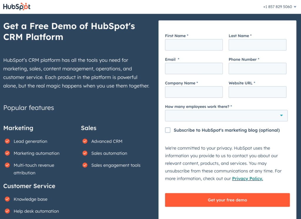
In summary,, the “Request for Demo” feature should be user-centric, informative, and streamlined, fostering a seamless transition from interest to experience.
Subscription and Payment Processing
The subscription feature is often with the pricing page, where the user can click a button to subscribe to the trial and paid version of your product. The subscription process involves multiple steps from collecting customer information, payment details, processing the necessary payments, and providing confirmation. Here are some of the elements of a subscription feature
- Transparent pricing, providing clarity on subscription costs and billing cycles
- Payment options, including credit/debit cards and digital wallets, are essential for accommodating diverse user preferences
- Secure Payment Processing is crucial to protect sensitive financial information and build user trust.
- Clear and User-Friendly Interface is vital for ensuring users can navigate through subscription options and processes without confusion
- Automated subscription confirmation notifications keeping the users informed about their subscription status
- Cancellation options and refund policies (if applicable) should be straightforward and transparent, contributing to overall user satisfaction.
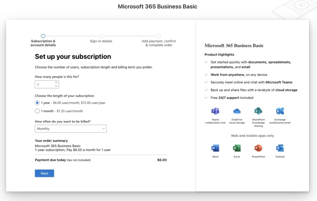
Constructing a user-friendly, transparent, and secure subscription feature, complete with robust payment processing, is essential in offering the users a smooth and reliable user experience.
User Registration or Sign Up
The prospect is at the last stage of the sales funnel, ready to sign up. The user registration or sign up serves as the entry point for users to access your product or services. The registration process often starts once the user subscribes to a trial or paid version of the software. As the pithy saying goes “First Impression is the Best
Impression”, a smooth, user-friendly sign-up process can significantly increase the user’s first impression and overall user experience.
Key elements of an effective “Sign Up” feature includes:
- Simple and Intuitive Form, asking for the minimum required information to avoid overwhelming the users
- Clear Instructions and Labels ensure users understand what is required at each step.
- Email or Social Media Integration can simplify the process, allowing users to sign up using their existing social media accounts.
- Security Features, such as captcha and SSL encryption, are vital to protect user information and build trust.
- Privacy Policy and Terms of Service Links should be easily accessible, providing transparency about data usage.
- Error Messages need to be clear and helpful, guiding users to correct any mistakes made during the sign-up process.
- Success messages should be clear and helpful and inform users that they are progressing well and in the right direction.
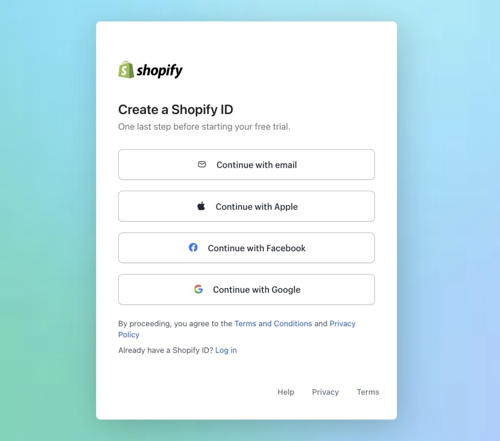
In summary, the “Sign Up” feature should be crafted with user convenience and security in mind, ensuring a hassle-free and trustworthy experience that paves the way for sustained user engagement and retention.
Chatbot
Through the customer journey and beyond, customers often have many questions on the product or how to use it effectively. In modern websites, the chatbots play a vital role in addressing those questions as and when they need. A chatbot, once considered to be a nice to have, has now become an essential, serving as an interactive touchpoint that facilitates real-time communication and engagement with users.
For the initial stages of the journey, like awareness and consideration, a chatbot can offer immediate responses to preliminary inquiries, offer insights into product features, and share relevant content, helping in building interest and trust. During the consideration and conversion stages, it can assist users in utilizing the service effectively, addressing technical queries, and guiding through the purchasing process. In the retention and advocacy stages, a chatbot can provide continuous support, gather feedback, and inform users about updates and new features, thereby maintaining engagement and encouraging loyalty and referrals. Here are some of the key features setting up a chatbot:
- Chatbot type – define clear objectives and set up the right type of chatbot, such as lead generation or customer support bots.
- Tone – user-friendly design and conversational tone are important to make the interaction smooth and helpful
- Smart – the bots should be programmed with adequate knowledge about your product or services, so it can respond properly for customer queries.
- Continuous improvement – similar to humans, the bots need to be taught regularly to improve the knowledge base. Testing and refinement should be part of the continuous improvement.
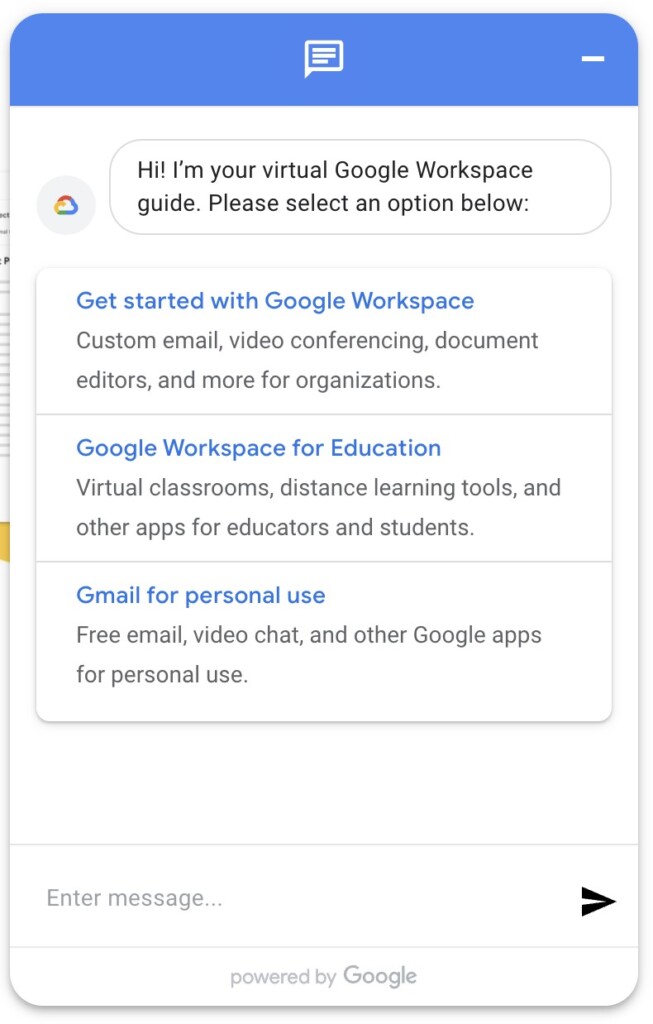
In summary, a chatbot is not just a feature; it’s a dynamic engagement tool that, when implemented thoughtfully, can significantly enhance user experience, relationship, and loyalty throughout the customer journey.
Customer Support
The sales process never stops at the subscription, it continues throughout the customer lifecycle. A good customer can be an advocate or brand ambassador referring new customers and continue working with your product. Hence, customer support is crucial for continued success. The customer often uses the customer support or contact us page for any assistance, information, or address any concerns.
Key elements of an effective “Customer Support” page includes:
- Clear contact information, such as email addresses, phone numbers, or support ticket systems, enabling users to reach out via their preferred method
- FAQ sections are also essential, providing immediate answers to common queries and reducing the load on support teams.
- Live Chat options can offer real-time assistance, enhancing user satisfaction through instant resolution
- User-Friendly Interface and Navigation ensure users can easily find the help they need, reducing frustration.
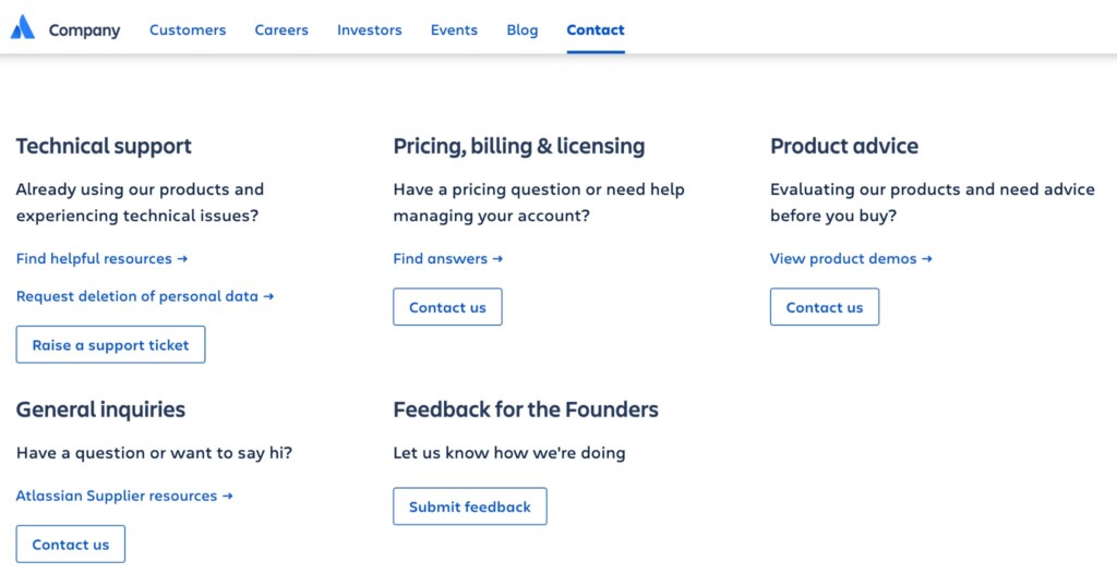
In conclusion, a well-structured and user-centric “Customer Support” page is indispensable for a SaaS business to sustain user satisfaction, resolve issues promptly, and cultivate enduring, positive relationships with its user base.
Summary
Crafting a seamless and effective SaaS website involves integrating various essential pages and features. As we have seen, each page serves a purpose, and a carefully crafted website should help customers through the journey, provide relevant information at the right time, and convert successfully. Your business is unique, and Minutly brings the right talent and solutions best suited for your specific needs. Dive into Minutly and start building a website that resonates with your business values and meets your customers’ expectations!




50+ Website features that makes running a business easier
Top 10 essential features for a SaaS website
Website with a purpose: How to drive quality website traffic?
Website with a purpose: How to capture more leads.
What is a Service Catalog?
Top 10 Essential Sales Service Requests Every Business Should Offer
Sharing your Minutly Catalog
Setting up your catalog